Visualizing Global Cyber Incidents
The invisible threat
Bilateral and multilateral conflicts between states have been a part of human life since the dawn of settlement. While the societal impact varies greatly from conflict to conflict, prior to the invention of the computer and, subsequently, the internet, conflicts were largely visible to those involved, whether through diplomatic discussions or armed warfare.
In the digital age, a new, less visible type of conflict has emerged: those taking place purely in cyberspace. These attacks are carried out by individuals or groups whose identities are as opaque as their arsenals, yet their impact already rivals that of many traditional, visible conflicts.
As society continues to automate and digitize production systems, public data, and information exchange, almost all state and non-state systems have become vulnerable to cyberattacks. Last week alone (July 27 - August 3, 2026), I found incidents targeting CocaCola production facilities, Craneware customer data, freshwater infrastructure, the UK Department for Education, or resident data from the registry of Liechtenstein. And these are just the ones that made it into the news. If you want to see a live-map of the absurd number of recorded small-scale attacks happening every moment around the globe, you should definitely visit the Kaspersky cyber threat map, as well as the Threat map from CheckPoint Software.
The EuRepoC’s Global Dataset of Cyber Incidents
My attention to this matter was sparked while listening to the SWP Podcast (a German/English podcast on international foreign and security policy), where they mentioned a cyber incident database maintained by the European Repository of Cyber Incidents (EuRepoC), an independent research consortium dedicated to better understanding the cyber threat environment in the European Union and beyond.
Their latest published dataset is a collection of four .csv files, highlighting different perspectives on the global cyber incident situation, one of which caught my attention: The “Dyadic Dataset”, a perspective on the data that specifically focuses on incidents between state dyads (pairs of states).
Since pure .csv files are not the most user-friendly way to explore data, I set out to see if someone had already visualized the data in a more interactive way. After a bit of research I found that the EuRepoC themselves had already created their own dashboard, which is a great starting point for exploring the data. The way they visualized the dyadic dataset, however, did not give me the interactive experience I was looking for, so I started to create my own dashboard, the prototype of which you can explore below.
Let’s explore how the dashboard works, what went into its creation, and what insights we can gain from it. The technical insights we will explore on the way, while for the cyber security insights, I will provide a distinct section at the end of this post.
The dashboard
Design idea
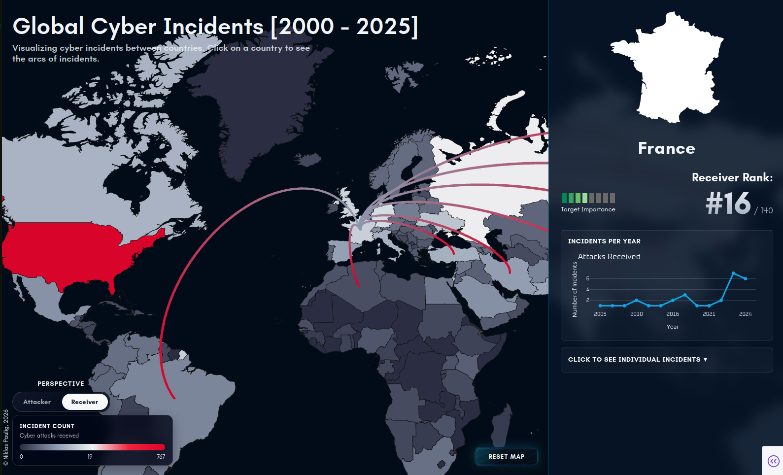
I thought of a 2D world map where each country is color-coded based on the total number of cyber incidents it has been involved in. When a user selects a country, the map highlights all incident dyads involving that nation, preferably with a switch between the attacker and receiver perspective. Visually, these dyads would be represented as arcs connecting the two countries. Clicking on an arc would reveal a popup with more details about that specific incident.
Additionally, a side panel would display key metrics for the selected country, such as a timeline of incidents, the most frequent attack types, and perhaps the country’s global ranking based on its cyber incident history.
That’s already enough to get a first prototype up and running. Let’s see how far we can get with this idea. You can see a screenshot of the prototype dashboard below, which is still a work in progress, but already provides a good overview of the global cyber incident situation.
The tech stack
My home turf is Python, therefore the Plotly Dash framework was on my waitlist for a while, as it promised to be a fast prototyping tool for creating interactive dashboards. I also tested out Streamlit, which is another Python-based framework for creating interactive dashboards, but its lack of flexibility and customization options made it less appealing for this project, so I quickly abandoned it.
Foreshadowing
It turns out, that we do have to write a bit of JavaScript to get the dashboard to a reasonable level of interactivity, as my initial idea of rendering entire world maps on the server and sending them to the client upon callback made the app awfully slow.
In hindsight, I should have gone entirely either with a native JavaScript framework like Next.js or SvelteKit, or maybe even with Rust-based leptos, for WebAssembly-based rendering, as even with full client-side rendering, the app is still not as snappy as I would like it to be. But, as I said, this is a prototype, and I am happy with the results so far.
Dash is a server-side framework that controls a client-side rendered frontend. Python handles the data and business logic, while React renders the interface in the user’s browser. Basically, the core logic of the app is written in Python running on a server, while the UI rendering is done in the user’s browser using React. Page updates are achieved by dynamic component updates, where the browser sends a request to the server, which then updates the relevant component’s state and sends a JSON response back to the browser, which then re-renders the component.
Working with geographic data
To realize a clickable world map, we cannot avoid using geographic data. The most common format for this is GeoJSON, a standard for encoding a variety of geographic data structures. The fact that it is JSON-based is quite convenient, as the data transfer between our server and client relies on JSON as well.
Next, we need a GeoJSON file containing the geographic boundaries of every country in the world. Luckily, there are ample free resources online for this task, most notably naturalearthdata.com and GeoJSON-Maps. I opted for the latter because its interface is incredibly straightforward. I downloaded the entire world in medium resolution, which amounts to approximately 4.4 MB of JSON data.
To render a clickable world map from this data and generate the dyadic arcs, we can kill two birds with one stone by using deck.gl, or rather, its Python wrapper pydeck supporting both of these tasks out of the box. I used the GeoJsonLayer for the map itself, displaying the country’s name on hover, and the ArcLayer for the clickable dyadic arcs. For the arcs, I chose to display the “name” column from the dyadic dataset as a tooltip, which provides a short description of the incident.
Caching the GeoJSON data
In my original design, I wanted to implement a color-coded map for both the attacker and receiver perspectives. However, if I were to simply build a perspective toggle that requests a newly color-coded map from the server each time, we would run into two problems. First, building the map is computationally expensive; it requires calculating an incident count per country and injecting that information into the GeoJSON. Second, sending the entire 4.4 MB world map from the server to the client on every toggle is wasteful and would dramatically slow down the app on slower connections. A similar logic applies to the arcs.
Luckily, we can get around both problems relatively easily. Since none of the data we display is dynamic, there is also no need to dynamically compute anything. Once we calculate both map views and the arcs, we cache them to the client via Dash’s dcc.Store() components, to quickly retrieve them once the client asks for the data.
Caching everything
Really, no data in the entire app is dynamic, so it makes sense to cache all possible responses, at least server-side, to strip away any backend computation. This is also what I did for the prototype, and it led to a significant improvement in interactivity, as now only the connection speed determines how responsive the app is.
I now had a decision to make: Thick client vs. thin client. To drive interactivity to a maximum, I could store all cached responses, therefore basically the entire app, in the client’s cache. This would leave the logic on the server and the data at the client. However, this would require the client to download all available data upfront before the app is useable (thick client). The contrary, leaving the data on the server makes the client thin, without much data on its side, but with increased loading times due to regular fetching of additional data upon request.
At the moment, I am in a sort of hybrid, where most of the data is already client-side but all individual incident information is still fetched from the server. I plan to change this, as the loading time for countries with high incident counts like China or Russia are still not satisfying, but for now it’s fine.
Deployment
Deployment is fairly straightforward, as Dash is a WSGI application, which can be deployed on any WSGI-compatible server. I chose gunicorn, a Python-based HTTP server for UNIX.
To run dash with gunicorn, you just need to point gunicorn to the Dash app’s server object, which you can extract from the Dash app instance like this:
# app.py (minimal example)
from dash import Dash
app = Dash(__name__)
server = app.server
Now, I want gunicorn to spawn two workers to handle multiple requests, and importantly use the --preload option, which loads the application code before the worker processes are forked. This is important because it allows the workers to share the same memory space for the cached data, rather than each worker having its own copy of the data. The full command to run the app with gunicorn looks like this:
gunicorn --workers 2 --preload app:server --bind 0.0.0.0:1234
The entire app is then dockerized and reverse proxied via my gateway, which handles TLS termination and routing. The --bind option exposes the app to the docker network on port 1234, which is then routed to the outside world via the gateway.
Code
Take a look at the code on GitHub if you want to see how the dashboard was implemented. The repository contains the entire source code, including the data processing scripts, the Dash app, and the Docker configuration for deployment:
So far on the technical side, we have covered the design idea, the tech stack, working with geographic data, caching strategies, and deployment. Now let’s take a look at some insights we can gain from the data itself.
Cyber security insights
Since I already took this data from the EuRepoC project, I want to take the opportunity to recommend their publications archive, in which they regularly publish high-quality reports that go into great detail about the cyber threat landscape. In the following, I will comment on some of the insights I gained from exploring the data, but I will not go into too much detail, as this is not a cyber security blog, and I am not a cyber security expert.
On the attacker side, the two most active countries are China and Russia, which did not really surprise me, as they possess ample cyber infrastructure and often engage, even publicly, in state-sponsored cyber operations.
What truly surprised me, however, was seeing Iran and North Korea ranked as the third and fourth most active countries. North Korea is an especially fascinating case. While the country rarely misses a chance to parade its conventional weapons, it is generally viewed as a resource-starved hermit kingdom, largely disconnected from the digital world. Despite this profound isolation, their digital footprint tells a different story, proving they have quietly but heavily invested in building a massive cyber arsenal.
Shifting to the receiving end of these attacks, I was equally surprised to see the United States leading the list. It is certainly reasonable to assume the U.S. would be a major target, given its massive tech sector and international prominence. However, one might instinctively expect nations like Iran, Russia, China, or North Korea to bear the brunt of these campaigns. Between their vast energy and rare-earth reserves, strategic geopolitical positioning, and verified or suspected nuclear capabilities, they seemingly offer lucrative targets for state-sponsored espionage. Yet, the data clearly confirms that the U.S. sustains the highest volume of cyberattacks, a striking testament to both its unparalleled global influence and the immense value of its digital infrastructure.
Disclaimer
I do not have any affiliation with the EuRepoC project, nor do I have any insider knowledge about the data. I am simply a data enthusiast who found their dataset interesting and wanted to explore it in a more interactive way. The insights I provided are based on my own interpretation of the data and should not be taken as definitive statements about the cyber threat landscape.